I was honored to be the speaker tonight for the Flower Mound Area Republican Club's January meeting. The major topic was that it's relatively easy to balance the budget simply by getting spending modestly under control.
I had prepared two PowerPoint slides to help illustrate the points, but due to a miscommunication I wasn't able to slow the slides. So here they are.

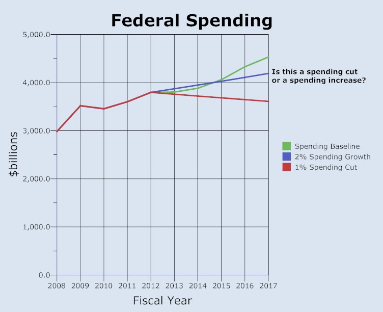
This chart shows 1) The spending baseline, in green. Notice that it ascends steeply upward despite the fact that the federal government considers this to be a "flat" spending scenario. Anything beneath this, even 2) spending growing at 2%, is considered a "cut" in the language of the federal government. The third line 3) is an actual 1% cut in spending, not a cut from the baseline, but a real cut from the previous year's spending levels.

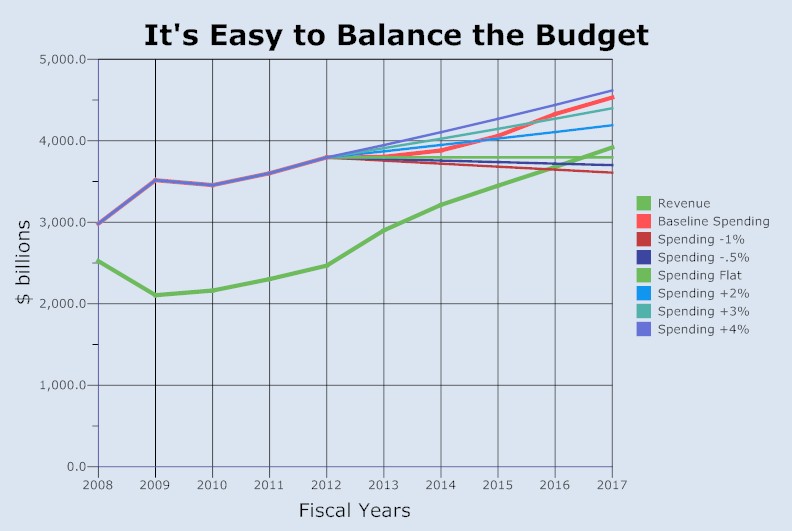
This chart shows current revenue growth projections, which are reasonable, and a number of spending controls. Note that almost any restraint on spending growth gets the lines to cross and balances the budget without tax increases in a few short years. As per my talk, my favorite scenario, at least in the current political environment, is the spending freeze (lime green line), especially since President Obama called for a spending freeze in his 2011 State of the Union Address. Let's hold him to it.

